SU Officially Opens $117M Patricia R. Guerrieri Academic Commons
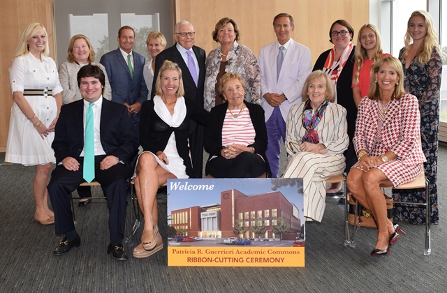
Salisbury University President Janet Dudley-Eshbach (back row, center) joined members of the Guerrieri family at the ribbon-cutting ceremony for the campus’ new Patricia R. Guerrieri Academic Commons.
SALISBURY, MD---For years Salisbury University students have studied in what was considered by some as one of the worst campus libraries in the country. According to the American Library Association, the SU facility provided less than one-third of the minimum recommended seating for a student body of SU’s size and less than half the necessary space for library materials. Its collections were last among its performance peers, but library staff couldn’t add to them because there was no room.
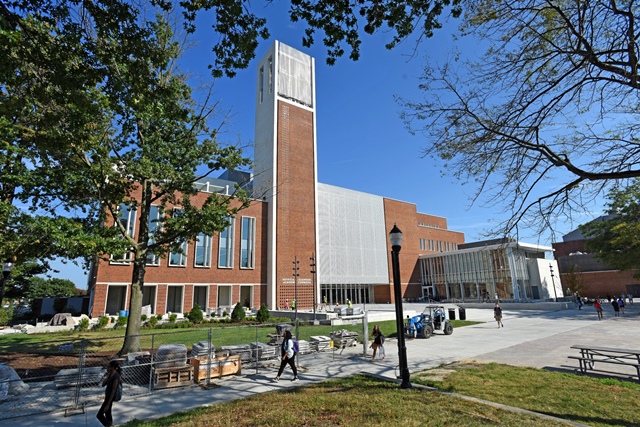
Today, that changed. Before a jubilant audience of students, faculty, staff, alumni and friends, SU President Janet Dudley-Eshbach, with donors and other supporters, cut the ribbon on the new $117 million Patricia R. Guerrieri Academic Commons (GAC): At 221,000-square-feet, the largest academic construction project since the founding of the campus in 1925.
“Words cannot begin to de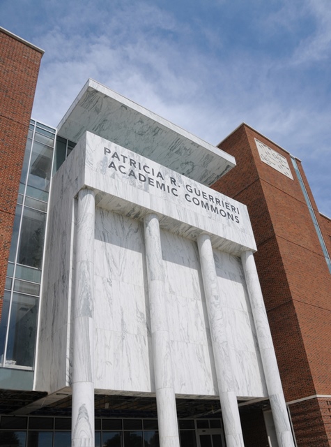 scribe what I’m feeling today,” said Dudley-Eshbach. “This is the most important building project during my 17-year career at Salisbury University. As we planned the structure, our thinking was not simply to erect a bigger and better library, but to transform the learning experience for students and for the University at a critical time in its evolution. The library was intentionally placed in the heart of main campus because we see it becoming the epicenter of learning in what Thomas Jefferson referred to as the ‘academic village.’ That is one reason why we are calling this an ‘academic commons.’ It is a wonderful library—and far more.”
According to Bryan Irwin of Sasaki Associates, principal architect of the GAC, campus libraries, after years of existential crises (“Will the library be relevant in the age of the internet?”), are in resurgence, reasserting themselves as vital to the academic experience. “The Guerrieri Academic Commons is at the leading edge of this moment,” he said.
The building was named in memory of SU alumna Patricia R. Guerrieri, whose portrait by artist Laura Era of Troika Gallery in Easton, MD, hangs in the lobby. An omnivorous reader, Guerrieri instilled a love of learning in her children. Three of them attended the campus elementary school, whose former site became the location of the GAC. The Guerrieri Family Foundation donated $8 million toward the library and its collections.
“Our mom was always doing special things for others,” said Michael Guerrieri. “She loved learning about nature and history. Her boundless curiosity made her a natural researcher. We are proud to honor her in a way that will help so many people.”
“We would not be standing before such a magnificent structure today without the generosity and support of the Guerrieri family,” added Dudley-Eshbach. “Throughout the decades, they have given so much to this campus and to the Eastern Shore. Their name is not new to us: The Guerrieri University Center, the Guerrieri Laboratory Wing, Guerrieri scholarships—at pivotal moments, this family has been here for our students, for those who teach them, and for residents of our region. Our new center of campus and community learning will memorialize a great woman and her caring, civic-minded family.”
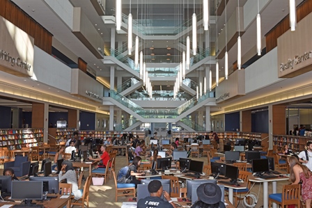
The soaring atrium of the four-story facility features a sunken center Research Commons for students illuminated by skylights and a glass wall.
Nearly four times larger than the former library, the GAC is also twice as tall (four stories as opposed to two). It unites a community of student academic services and programs formerly scattered across campus. (They include the Writing Center, Center for Student Achievement, TRiO, Math Emporium and a new maker lab with 3D printing.) In close proximity are a new Faculty Center, with meeting rooms for those engaged in cross-disciplinary study and also comfortable seating for different schools and departments to socialize; a new Graduate Commons for SU’s growing population of masters, doctoral and certificate students; and the Office of Instructional Design and Delivery, whose services include audio and recording studios for online and distance learning.
If the second floor is devoted to collaborative learning, Dr. Beatriz Hardy, dean of libraries and instructional resources, thinks of the first as “Research Central,” housing Information Technology’s Help Desk and librarian offices for easy access by students and other visitors.
Nearby, a two-story café has colorful counter facades and surfaces crafted from recycled documents. Its Hungry Minds Express and Rise Up Coffee Roasters adjoin a 24-hour study space. Food is made to order and includes such specialties as Dr. Janet’s South of the Border Burger, featuring Tex-Mex toppings (named after SU’s President, who is a Latin American scholar), as well as snacks and convenience goods. Rise Up, a local chain founded in 2005 by SU alumni Timothy Cureton and Noah Kegley, serves signature items including fair trade and organic coffees.
The third floor provides traditional library spaces with book stacks and reading nooks for quiet, individual reflective study. And there will be room to grow collections.
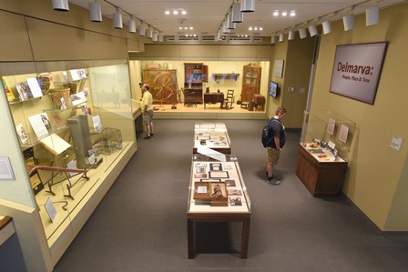
The facility houses the popular Edward H. Nabb Research Center for Delmarva History and Culture, and space for permanent and changing exhibits.
On the fourth floor is the library’s popular Edward H. Nabb Research Center for Delmarva History and Culture. Nearly tripling in size, it also is growing with the integration of the University Archives and Special Collections. Climate-controlled archival and artifacts storage facilities, with museum-quality painting and textile racks and shelving, will be on par with those at national research universities and state-level archives, said Dr. Creston Long, center director. Part of the complex is an archaeology lab. A permanent exhibit will focus on Delmarva life, and rotating exhibit space offers a teaching lab for students. A fully equipped classroom will become a laboratory for the humanities. Barbara Charles, a consultant who has worked with the Smithsonian Institution, assisted in planning.
On the other side of the fourth floor is an Assembly Hall and patio with spectacular views of campus and of Salisbury. Accommodating up to 400, its sophisticated light and sound systems include digital audio networking, “robe-Mini-me” intelligent lighting, and banks of theatrical lights traditionally used on Broadway with a potential 50,000 wattage. The space, which will accommodate everything from recitals and lectures to dinners and receptions, provides an excellent opportunity for students to learn live event production, said Matt Hill, event technical services coordinator.

The Patricia R. Guerrieri Academic Commons was being utilized by students as soon as classes began on Monday, August 29.
Technologically, some 600 computers and 85 large flat panel monitors are spread throughout. This is more than three times the number of public computers as in the old library. Thoughtfully arranged individual and group study spaces, multimedia labs, smart classrooms and other convenient and flexible arrangements are designed to support student learning, research and creativity. The most connected building on campus, wireless coverage in the GAC is the equivalent of some 3 ½ football fields, said Duke Darrigio II, director of information technology operations.
One of the most striking features of the building people will rarely see: a 20,000 square foot “lawn” on the roof comprised of sedum and other regional low-growing plants. They will act as a collection and filtration system, absorbing and cleaning rainwater before a system of stone and concrete collectors distributes it back into the ground, significantly reducing runoff. It also will serve as a natural buffer between the roof and sun, providing an interior cooling effect. This is just one of the GAC’s sustainable features.
Uniting the building’s multiple services and offices is a soaring 62-foot-tall atrium lit, in part, by skylights and marked by a dramatic staircase. The staircase design, architects say, was inspired by the silhouette of the crab. Colors of ocean, beach and bay are found throughout, another Eastern Shore reflection.

The Guerrieri Academic Commons features the University’s first green roof.
Sunlight pours through large windows and upper floors enjoy sweeping vistas. “People spend long hours in a library, and that time is spent much more humanely if one senses a connection with the natural world,” said Irwin. “One of the wonderful things about libraries, particularly academic libraries, is the way they come alive at night. We were very mindful of creating a dramatic and inspiring beacon.”
Efforts were made to design a building that was contextual with the rest of campus, from choice of brick and detailing, to an honorific entrance along Route 13 expressed in white with rounded columns, echoing the front of Holloway Hall, the University’s first building and a historical landmark. This civic east façade for the community is balanced by an interior, more informal and varied campus entrance off Red Square, a popular outdoor student area. Architects said they enjoyed working with students who were part of the design process.
One of the GAC’s most distinctive features is a 147-foot-high carillon tower, the tallest point on campus. Donated by Bill Church of Greenville, DE, in memory of his longtime partner, Samuel R. Brown, the 48-bell instrument will be installed later this year.
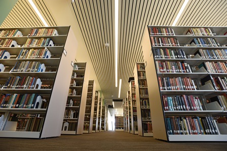
In addition to numerous academic services, the Guerrieri Academic Commons is a much needed new home for SU's library.
“Another individual who made this wonderful resource for the Eastern Shore possible is retired Delegate Norman H. Conway, past chair of the Maryland House Appropriations Committee,” said Dudley-Eshbach. “Our library serves not only University students and faculty, but the population of 210,000 in the four counties of Maryland’s Lower Shore. Thanks to Delegate Conway, this building has the potential of inspiring young minds and all throughout our region who believe in the benefits of learning.”
In addition to Sasaki Associates, whose honors include award-winning work at libraries across the country, their Maryland partner and architect-of-record is the nationally recognized higher education architecture and planning firm Ayers Saint Gross of Baltimore. The contractor, Gilbane Construction, has also been recognized by Fortune magazine and honored for its work at Maryland campuses.
For more information, visit the SU website at www.salisbury.edu or call 410-543-6030.
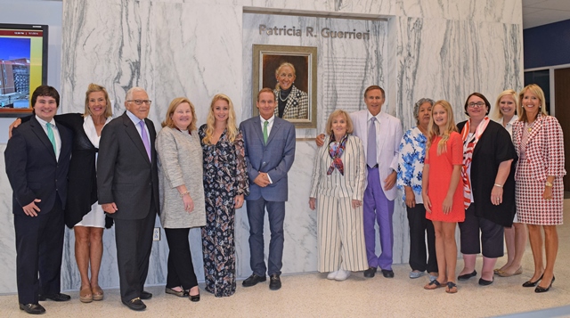
Inside the Patricia R. Guerrieri Academic Commons, members of the Guerrieri family gathered in front of a painting honoring their matriarch, “Patti Lou,” for whom the facility is named.
Patricia R. Guerrieri Academic Commons By the Numbers
2 stories in Hungry Minds Express

3.5 football fields’ worth of wireless coverage
4 floors
12 classrooms
15 group study rooms
24 hour student study spaces
40+ seats in board/meeting room
48 bells in carillon
62 feet = height of the central atrium
85 large monitors for classrooms and study areas
400 seats in the Assembly Hall
600+ computers in the building
2016 = year opened
8,700 = population of students served
15,612 square feet for student academic services
19,756 square feet in the Nabb Research Center and archives
210,000 = population of surrounding counties served
221,000 square feet overall
$8 million contributed by the Guerrieri Family Foundation
$117 million cost
$238 million estimated economic impact during construction
An Interview with Bryan Irwin, Principal, Sasaki Associates,
and Architect for the Patricia R. Guerrieri Academic Commons
 What excited you about this project?
This project offered the opportunity to be involved with Salisbury University at a transformative moment in its history and to create a building that is reflective of that moment. Salisbury is a university deeply rooted in its community, but its sphere of influence is rapidly expanding. To create a building that was respectful and proud of Salisbury’s history and traditions, yet forward-looking and ambitious was an exciting challenge.
How is it different from other libraries you’ve worked on?
Just as no two universities are the same—each one reflective of a unique place and institutional culture—the same is true with libraries. In the case of Salisbury’s library, there is an interesting blend of serious academic research and collaborative, collegial, and informal spaces. One can see this in the mix of spaces within the building—a very unique combination ranging from quiet contemplative individual study spaces to an assembly room capable of seating 400 people.
How do you research projects like this? Are libraries changing?
As a firm, Sasaki has the benefit of working on numerous colleges and universities across the country, ranging in type from small elite liberal arts colleges to major public land grant institutions. We have a good understanding of the issues these institutions are facing, the questions they are asking, and the ideas they are testing. In terms of academic libraries, we find this is a truly exciting moment. After years of existential crisis—will the library be relevant in the age of the internet?—we are finding libraries on campus in a resurgent mode, re-asserting themselves at the heart of the academic experience. The Guerrieri Academic Commons is at the leading edge of this moment.
What were the challenges on this project?
Frankly, there were many, and that was a good thing. Good design comes out of challenging conditions. In terms of the site, all four sides were uniquely different. For example, to the east, you have Route 13 and the interface with the community. This suggested a certain monumentality—the desire to create a front door and civic presence for the community. However, to the west, where the building fronts Red Square, the situation was very different. A student-centric space far more intimate than the Route 13 side, here we wanted to seek ways to bring the building down in scale and to make it much more informal and approachable.
When you design a building, is it like putting together a puzzle?
Not really, because a puzzle has only one way you can solve it. With a building, there are many solutions. The trick is to arrive at a solution that has a sense of inevitability—that the building accommodates the program and site, is reflective of the values and mission of the university, and “could not be any other way.”
In your design, you worked with a very specific vocabulary: lots of verticals and horizontals; not many curves or diagonals. Was that a design choice? An economic necessity? Both?
One of the issues the team focused on from a very early phase of the design process was how not to make the building feel too squat and pancake-like on the site. It is a very big building, and we did not want to add too many floors because we wanted the building to feel comfortable and connected on the interior. This left us with the possibility that from the exterior the building might feel low slung and bunker-like. By developing an inter-play of vertical elements—the window proportions, the vertical sun screens and, of course, the carillon tower—this gave the building a more upright, ennobling expression.
Were you inspired by a particular architectural period, for example, mid-century modern? If so, what do you find appealing about that era?
I have always thought of myself as a bit of an architectural mutt, my work being the result of respect and admiration for a number of eras and movements. This can be seen in the Guerrieri Academic Commons. The brickwork, colonnades and simple proportions of the punched windows is clearly a respectful nod to the rich tradition of the Georgian architecture throughout the region and campus. The way the natural light is scooped up and reflected into the main space is the result of an admiration for the great Finnish architects such as Aalvar Aalto and Juha Leiviska and their ability to create transcendent spaces with natural light. Meanwhile, the entry sequence into the building from Red Square, the way one steps up onto the raised platform, looks into the dramatic main space then turns away from the space only to enter the building and arrive at the main space from a different angle—that is the classic entry sequence into many Shinto gardens and shrines throughout Kyoto, Japan.
There seemed to be careful efforts to make the building contextual with the rest of campus. Would you talk about those choices?
This was an enormously important issue for Salisbury University and the entire design team. All of us wanted a building that was respectful of the Salisbury campus, yet authentic to its time—a building that speaks of being part of a continuum, respectful of its elders yet extending and expanding the legacy it was given. We spent a lot of time looking very carefully at the campus and its buildings, particularly Holloway Hall. You can see this in the choice of bricks, very much the same blended mix you find on Holloway and other buildings. Likewise, the way Holloway organizes itself on its main façade, with the overall building being brick but the honorific entrance expressed in white—that is the exact same thing we did on the Guerrieri Academic Commons.
Light seems very important in this building. How did that influence design and planning?
Light, both natural and artificial, is one of the most important elements of a library. People spend long hours in a library and that time is spent much more humanely if one senses a connection with the natural world. We worked hard to ensure that even in a building as large as the Academic Commons, all of the major spaces had views to the outside and spaces infused with natural light. Likewise, one of the wonderful things about libraries, particularly academic libraries, is the way they come alive at night. We were very mindful of creating a dramatic and inspiring beacon.
The Guerrieri Academic Commons is large. What did you do to try to maintain a human scale of proportions in the interior and exterior spaces?
In addition to the interplay of vertical elements that we discussed earlier, we were very careful to bring the scale of the building down as it met the ground. The colonnades on the east and west sides are an example of this, the way the café is pulled out from the building almost as a freestanding kiosk is another. Careful attention was also paid to the landscape and plaza areas that wrap the building, creating spaces and places for students and faculty to linger.
Designing a building for use by students and scholars may be different from designing a commercial or governmental project. How do students impact the design process?
This building is for the students and faculty of Salisbury, and if they do not find it a useful and inspiring extension of their academic life, we have failed in our mission. We listened very carefully to students, faculty and administrators during the design process, and the building is the result of their comments and observations. For example, students and faculty will find a wide variety of study spaces scattered throughout the building, from quiet individual spaces in tucked-away corners to see-and-be-seen spaces filled with areas for groups of students to meet and work together.
Were you involved in the color choices or interior selections? If so, what was the guiding design philosophy there?
The design team, particularly Jen Imbaro, worked very closely with the Salisbury team to create an interior that was attuned to the unique sense of place that is the Eastern Shore. Bea Hardy was very helpful in bringing to our attention a number of artists and painters whose work expresses the colors and textures of the Eastern Shore. Those colors and textures, and the unique quality of light are what we tried to convey in the interior.
Was the building on a tight construction schedule? How did that influence the design process?
All things being equal, the design schedule for the Guerrieri Academic Commons was a bit more aggressive than the team is used to. One always wishes to have more time in the design phases. Design is an iterative process and time is your biggest enemy. At the same time, the aggressive schedule focused our efforts and kept us from wandering too far afield.
What are you happiest about in the building?
I am happy about many things, but most happy about how a large team of people—the University of Maryland Facilities Management group; the students, faculty and administrators of Salisbury University; our teammates at Ayers Saint Gross and Gilbane Construction, and the many sub-contractors who poured their hearts and souls into the building—worked together to create a building that will be at the heart of the academic experience and inspiring students at Salisbury University for many generations to come.
Maryland Partner and Architect-of-Record for the
Patricia R. Guerrieri Academic Commons
 What excited you about this project?
Perhaps what was most exciting to us when we first learned of this project in 2012 was that the Academic Commons presented the opportunity for our design team to collaborate with many participants from the University to explore and define the potential for this legacy building as a successful hub of broad academic and social experiences at Salisbury.
We were excited that the Academic Commons was envisioned to serve the University and the Delmarva community with a series of distinct programmatic offerings in a single building at the heart of the campus, and we looked forward to developing successful solutions to the campus planning and design challenges that this opportunity presented.
What were the challenges?
Academic buildings are designed to last at least 40 to 50 years. These buildings will influence the experiences and success of its students, faculty and visitors for many generations, so we have to be very thoughtful in our execution.
Each building project has its own unique challenges, and addressing them through the evolution of the design process results in success. Two of the primary challenges for this project included fitting this large building to its site while respecting SU’s established campus context, and providing clarity of its internal organization between the diverse student and public-focused program spaces.
The challenge, and excitement for the Academic Commons was to carefully design this contemporary new building between Route 13–the “community” face of the campus–and Red Square, the most active outdoor student space. The final design addresses each side differently, with a more formal, civic presence toward Route 13 and an informal, moderate scale toward Red Square. However, a unified overall building was composed through the use of similar materials and elements on all sides while respecting the scale, materials and context of the surrounding campus.
Providing organization within such a large academic building program can be a challenge, but is critically important. The Academic Commons has an internal logic to its planning that begins with the two major entrances from opposite sides. Once inside, monumental stairs and elevators are clearly visible alongside the atrium at the center of the building. The building’s programs are organized floor by floor so users are always aware of where they are; the Atrium is the common point of reference. The Nabb Center and Assembly Hall–the largest public-focused program spaces–are co-located on the fourth floor across from each other and alongside the atrium. On this floor, they are able to take advantage of wonderful vistas above the campus.
Designing a building for use by students and scholars may be different from designing a commercial or governmental project. How do students impact the design process?
Foremost, the Academic Commons will serve faculty, students, staff and community members. A primary mission of the building is to be the academic hub with a variety of settings for students as they experience their academic and social lives at Salisbury. Unlike commercial and governmental projects, which have tenants, or occupants who will occupy the same spaces for years, most students experience a campus and use its buildings for about four years and then graduate. Within their four years, student needs and expectations change as they mature.
Our design team of architects, interior designers, library planners and engineers engaged a variety of student participants in the design process and many aspects of the design is a result of their contributions. We find it enlightening and enjoyable to engage students in the design process, freshmen through graduate students, to listen to their perspectives and their reflections on what they have found to be most impactful on their academic lives. We want this building to be a touchstone of their academic experience at Salisbury. To accomplish this in today’s culture, the library must have social spaces and a strong technology infrastructure.
Was the building on a tight construction schedule? How did that influence the design process?
The design and construction schedule for the Guerrieri Academic Commons was aggressive; the University altered the traditional method for engaging architects and a contractor to a more streamlined design/build process as a result. This methodology created a tight bond between the design team and builder from the onset, resulting in the successful delivery of the building. Our design approach included an evaluation of design ideas by the construction experts; as a result, many of our design solutions were those that could be implemented without extensive lead times or complicated construction processes, the one exception being the bells that will be installed into the carillon tower post-occupancy.
Were there any surprises during the construction process?
The project began with a “partnering” session that included everyone involved in the design and construction of the project–designers, contractors and administration, and one of the goals from that meeting was to eliminate surprises. We are very proud that everyone worked well as a team to manage the inevitable bumps in the road that occur during a major project.
As always, there were a few unique surprises that occurred along the way, such as the need to delay the demolition of Carruthers Hall until the ospreys left their nest on top of the radio tower and finding that the underground electrical conduit that we needed to tie into for the building’s electrical service was collapsed and had to be replaced. A very unique aspect of this project has been the inclusion of the carillon, and the process of engaging the best foundry for the casting of the bells.
What are you happiest about in the building?
We are happiest about many, many aspects of this project, but mostly for two outcomes.
On the personal side, we are happy that we were extraordinarily successful as a designer/builder/owner team. Through this four-year process we developed a close-knit relationship toward a common goal. In addition to our design/build teammates–Sasaki, our consultants and Gilbane–we worked almost daily with the faculty and administrators of Salisbury University and the University of Maryland Facilities Management group during the building design phases. When construction began, this already large team expanded to include the many sub-contractors who dedicated their efforts to the success of the project.
The University stated from the beginning that the new Academic Commons represents “bold and ambitious initiatives.” We are proud that the building delivers on its expectations in so many ways, but mostly that the Academic Commons will provide its students a dynamic collaborative learning and study environment, rich in resources for success and personal growth.
